Jérôme Corgier Biography

In the early years Atelier Pariri operated with three designers from Lebanon, London and Paris (where Corgier himself resides). Together with the like-minded Lebanese Lara Captan, he set up the blog Jarajaja in order to experiment with the interchangeable use of Arabic and Latin (Roman) alphabets. During the period 2008 – 2010, this “workshop for two” pushed the boundaries of the creative vocabulary of typography; conclusion: Is it still type? It yielded a variety of flamboyant family members. Typography borders on calligraphy. Sleek Arabic sensuality sets Latin severity in motion in these hybrid letters.
The masterful penmanship ((καλός (kalós) = beautiful) points the way towards three-dimensionality. Suggested relief becomes fact when Corgier transforms lines into swelling strips of paper, a technique that later leads to the Spirales (Spirals) series. Another line of scrutiny pursues supposed sub-structures. Corgier furnishes the letters with ribs, made of small slats – naturally no pattern is the same – and creates a new type family, the Skeletype (Skeleton Type).
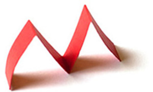
Paper appears to be the ideal raw material for Jérôme Corgier’s exploration of form in space. After a computer stage, during which he plays with form and constructs new ones based on straight lines and curves, he prints out the letters. He draws in the open spaces, creates new interstitial forms and picks out the colours. He then stacks, cuts sections away and adds others. Some letters appear to be composed like multiplex, with sections deliberately pared away. But with just a couple of creases, paper can also be folded and willingly bends. In order to emphasise the tortuous forms, Corgier opts for contrast between black and white or he works with brightly coloured paper and allows his letters to twist and turn like caterpillars. Finally, he photographs his progeny and sets them to work in new graphic enterprises.
Much of the experimentation can be seen in The Ultimate Alphabet (2011), his personal variation in paper and cardboard on his favourite typeface: the Witney type family. During the design process he never loses sight of the legibility of the characters. ‘Ultimate’ could actually imply that Jérôme Corgier is ‘lettered’ out. That time is still a long way off. For the time being he sees plenty of experimental scope for his quest for new “visual sensations”.
Text from Franck Van der Ploeg for the International Paper Biennal Rijswijk 2012.
Translation by Linda Fairwether Nash.
